This is a continuation of my series of posts on using Drupal as a data platform. In this post I show that you can create charts on data external to Drupal. I picked three modules to illustrate my point from a longer list of available contributed Drupal charting modules. There are two documentation pages that give more detailed information on Drupal charting modules. Modules related to Charts and Comparison of Charting modules.
I used the following modules to create charts on my external data views.
- Charts is the most popular Drupal charting module.
- Visualization API has Drupal 8 version available.
- d3.js because it uses arguably the most highly regarded JavaScript visualisation library, d3.js.
Installation and Licensing
Installing and enabling the modules for all three charts followed the normal Drupal module installation process. For the d3 module I had to download and place the Open Source licensed d3.js JavaScript file in the sites/all/libraries/d3/ folder. For the Charts and Visualization API modules I used Google Charts as the visualisation library. No third party library needed to be downloaded. The visualisation is provided as a service from Google according to their terms of service. Alternatively you can use HighCharts, a commercially licensed visualisation library as an alternative to Google Charts. Your choice of visualisation library/service should be guided by the type of data you will be displaying.
- d3.js is Open Source
- HighCharts is a great commercially licensed library
- Privacy may be an issue with with sending your data to Google.
Implementation
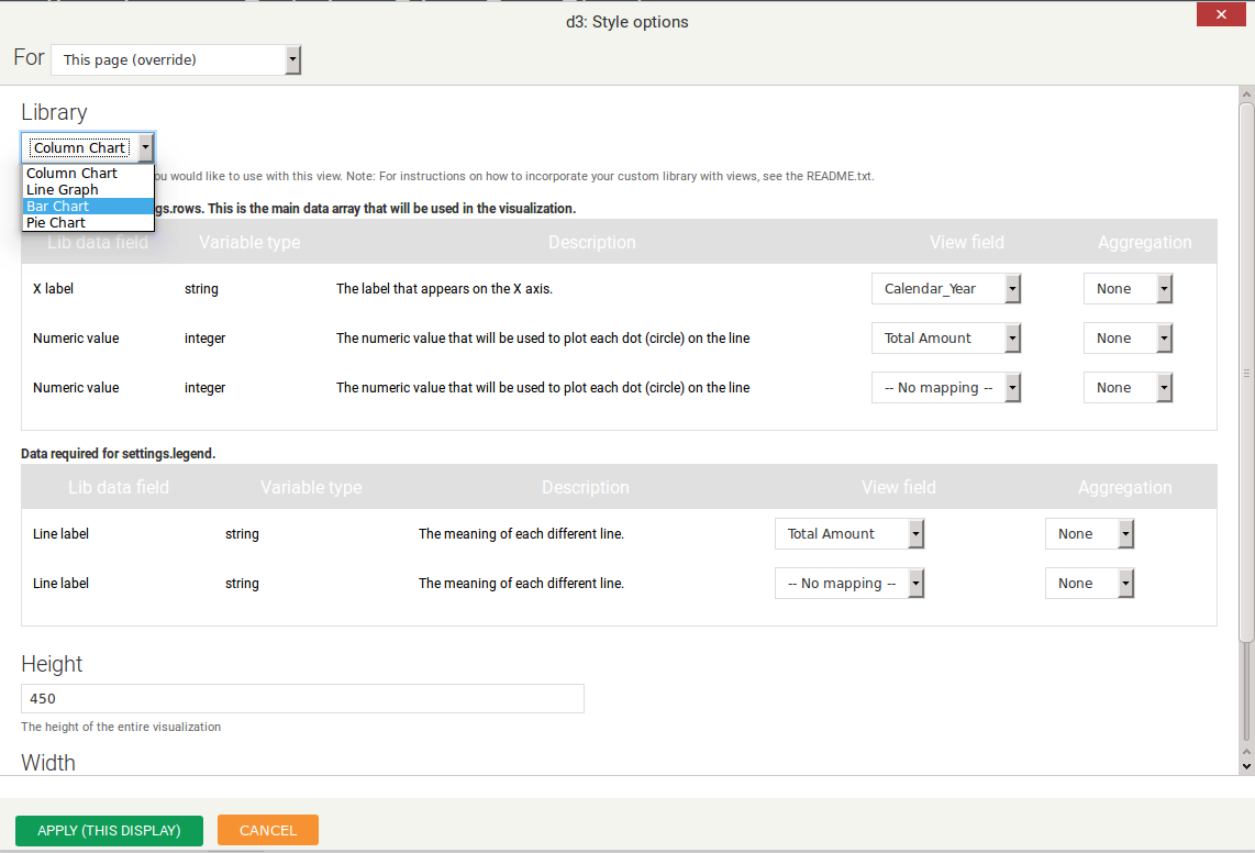
I added charts to an existing view that is based on external data. The steps to create a chart were similar for the three modules. In short these are the steps:
- Create new view display
- Selected your preferred charting module as the display format
- Configured chart
- Select chart type
- Configure/select numeric field to use
- Select field to use as label
- Add title and axis labels
Below are the modules and the types of charts available for use in views.
| Chart Type | d3 | Charts | Visualization API |
|---|---|---|---|
| Column | Yes | Yes | Yes |
| Line | Yes | Yes | Yes |
| Bar | Yes | Yes | Yes |
| Pie | Yes | Yes | Yes |
| Area | No | Yes | No |
| Scatter | No | Yes | No |
I created a column chart using each one of the three modules. You can view the these charts on my demo site. I found the process not complicated and after playing around with the settings I figured out how to configure the charts for my needs. I just had to figure out which field to assign to which property setting. The properties being the numeric field to use of the graph data and the field to use for labels.

Summary
There is no doubt that it is relatively simple to create charts using Drupal views. I was able to create my first chart within 10 minutes after downloading and installing each module. A chart is merely a graphical representation of data but the implications of business users being able to quickly see trends cannot be underestimated. With the right data and the right people looking at the data Views with charts can help a business run more efficiently and more profitably.
The Drupal views charts modules are not as configurable as traditional data visualisation software suites such as JasperReports and Pentaho. You cannot draw a second axis, control padding between chart and border and you cannot define drill down links on the graphs. Having said that, I quite liked the charts produced. Sometimes having too many options detracts from the real job of analysing the data. It is certainly very possible to quickly see trends using the graphs drawn using the Drupal modules. Last point I need to make is that the third party libraries/services used by these three modules are capable of more than just visualising simple charts. If you need more visualisations the modules can be used as a foundation to build better visualisations.